The first CSI Lawyer version was published already 11 years ago. Since then, we have continuously developed its functionality according to our clients' needs and regulatory changes. The annual version updates have brought, for example, the review process of preliminary invoices, e-invoicing, assignment phases, sub-assignments, dashboards, mailing lists and management of customer identification. The list is long. Fewer changes have taken place in the system's user interface, although customer expectations regarding the usability have also increased.
Too many clicks?
To make adaptation of CSI Lawyer easy, its user interface was initially developed to be Outlook-like. Our basic idea was to provide a clear system structure, group the functions required by different user types into task areas, and enable certain key functions from multiple places. Most users did like it as the system looked familiar and its logic was easy to learn.
However, many felt that the desired function was behind too many clicks, or were confused about finding the same window in different task areas. Over the years, the customer feedback has included praises for the system functionality and, at the same time, development wishes concerning the user interface. Particularly lawyers, who only utilize a fraction of the system's comprehensive functionality, have found the system quite hefty. Besides, modern browser-based applications available in the market have also shaped users' perceptions of what software should look like.
Why did it take so long to renew the UI?
In order to understand UI preferences of our customers, we carried out interviews and surveys already three years ago. However, the change needed to be postponed until the moment when we were able to deal with the massive workload required to redesign and implement the new UI. Touching a user interface is never trouble-free, and with a critical tool like CSI Lawyer you can't afford to take risks. User experience cannot be improved with pure cosmetic changes, but changes should not lead to software defects either.
When designing the UI change we were also painfully aware that the CSI systems already have almost 3000 users. And we all have felt the frustration when, in a hurry, we open a familiar system and notice that our favorite functions have disappeared due to a recent version update. Confusion caused by changes is inevitable, but we were hoping to be able to redesign the user interface in such a way that users would find it easy to use. Indeed, countless hours of work have been spent on user interface experiments and testing during the past year.
What are the main changes?
The main structure remains in the new user interface. Different functions of the task areas are still arranged into folders, their content opens as a list and can be filtered with different views.
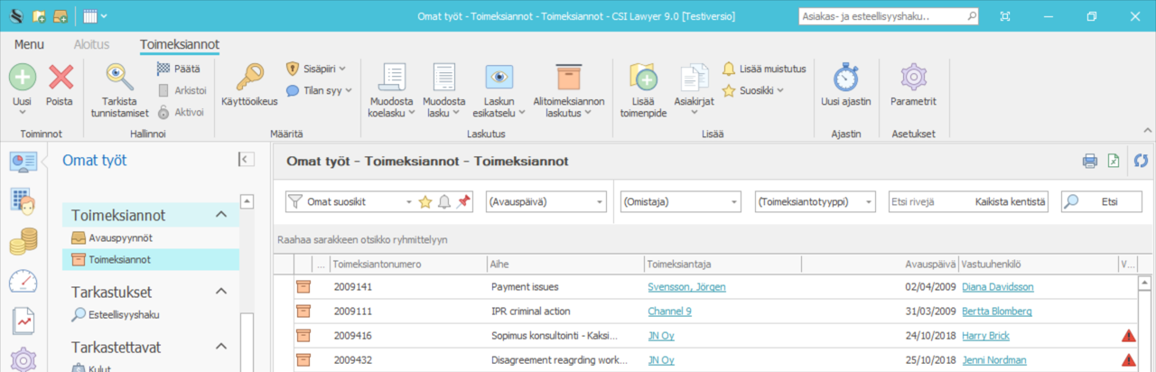
One of the main changes is abandonment of tabs that have frustrated many users. Windows opened by a user currently remain as tabs, making it faster to move between windows. In the upcoming version users can navigate between windows, and the software remembers the search criteria entered into each window. For example, you can work on a specific customer's assignments, visit your dashboard occasionally to see the status of your time entries, and return to the Assignments folder directly to the same customer's assignment list.
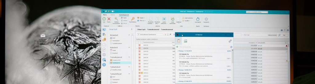
Another major change is the concentration of all customer information in one place. CSI Lawyer has provided a slightly diverse customer list in multiple task areas. The Workplace has included all clients registered in the software, the Assignments task area only clients having a role of principal, and the Financial Management task area clients who are payers. In the future, all customers will be found in their own Customers task area.
New illustrative icons
A picture often tells more that a thousand words. Therefore, CSI Lawyer's functions have got new icons making it easier to find the desired function.
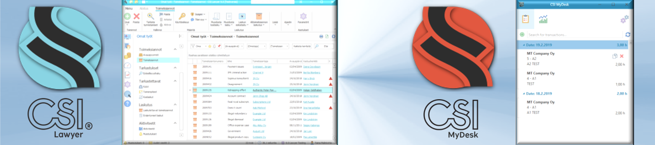
The CSI theme and icon have also been redesigned. CSI Lawyer will be found in the toolbar behind a turquoise icon. The CSI MyDesk application for quick time entries can be recognized from the orange version of the same icon.
The system's tree structure and the field order of its windows are also more logical, and the window ribbons have been arranged to offer the basic functions always in the same place. Of course, the number of clicks required by different functions has been reduced, too.
When will the new version be available?
The new version was taken for our own use in early autumn, and during the recent weeks it has passed our standard testing process. Currently we are updating the user manuals to reflect the changes of the new user interface. The old 300-page guide will be divided into more user-friendly role-specific instructions. In the coming weeks, we'll invite a few customers to test and comment on the new user interface to identify potential needs for finetuning the instructions.
We hope to update the version for the first customers before the year-end, and to start its general distribution in January. In addition to the new user interface, the version will naturally bring some new and improved functionality. We look forward to seeing how it will be received by customers.
 |
Harri Tiili CSI Helsinki, Managing Director, Partner Fills his calendar with finances and reporting. Focuses on time management and encourages others to do the same. Ensures that the business develops in the right direction but strongly believes in self-management. And after years in the business, still gets excited about new software development projects. |